
In case you hadn’t noticed the Olympics are on! For the duration of the event, the host country is the centre of the world. While the benefits of hosting are often disputed, there’s something to be said about the symbolic value.
For many, the Olympics brings to the fore a stirring sense of national pride…
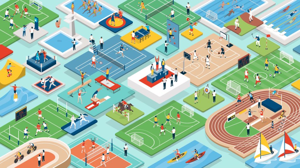
Aside from the medals and the opening ceremony, the most iconic manifestation of a specific Olympics, is its emblem and mascot. Striking, thoughtful emblems and mascots elevate a country’s image and expression on the world stage, while poorly considered designs are an overlooked opportunity.
It’s time for us to put in our two cents. We’re putting our favourites on the podium and first up, taking home the bronze is the 2000 Sydney Olympics.
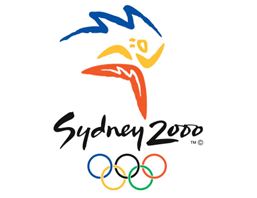
As Australians we admit this may sound a little biased, but indulge us. The use of colour reflects our climate and landscape, it is symbolic of the shape of the Sydney Opera House and takes on movement. Created with waves and boomerangs the emblem is laidback, somewhat adventurous and highlights Australia as “a modern metropolis on the edge of an ancient land.”
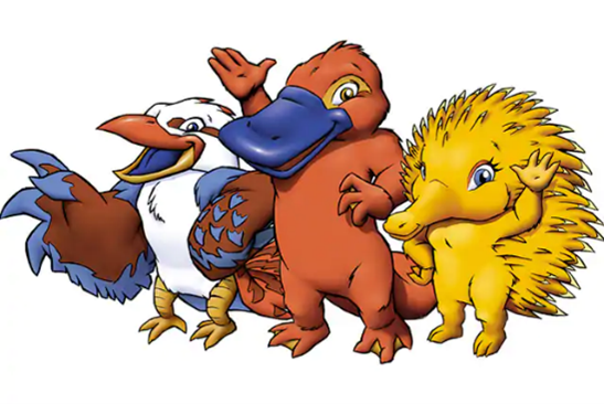
Alongside our emblem are the mascots. Reflecting Sydney’s logo colours, Syd, Olly and Millie felt quintessentially Australian. Together they symbolise the water, air, and earth. Behind the initiative was a desire to shine a light on Australia’s lesser-known animals, to remind the world that we aren’t just the home of kangaroos and koalas. Together with the emblem the overall style felt true to our spirit and undoubtedly Australian.
The silver medal goes to… Mexico!
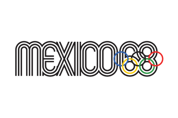
Mexico has this one in the bag. Like Sydney’s emblem, Mexico has managed to effortlessly distil its essence as a country. There is a strong influence from traditional Mexican art as seen in the repetition of lines and the fun and festive shape of the letters expresses the vibrancy of Mexico’s people.
Allegedly, the 1968 Mexico Olympics were the first that had Olympic mascots. Mexico recruited none other than El Jaguar Rojo de Chichen-Itza (red jaguar) & Paloma de la Paz (dove) however, they are somewhat elusive characters and this is the best we could do in showcasing the pair.
Who’s going for gold?
We think Japan!

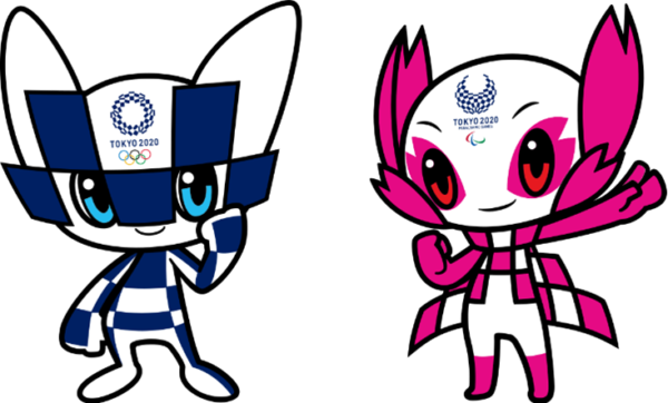
We are awarding them Gold as for us, the harmonised Ichimatsu (checkered) pattern conveys a sense of elegance and sophistication that we have long associated with Japan. Three different rectangles have been used in an asymmetrical pattern that comes together to create something wholly beautiful. The circle represents unity in diversity. As the Olympics is a platform to promote this theme, we think the emblem is entirely appropriate.
Sticking to form, the Tokyo 2020 mascot completes their expression of Japan as a hub for a creative virtual world of engaging characters and technology. The mascot is suitably named Miraitowa, which combines words to mean ‘future’ and ‘eternity’.
The mascots’ outfits mirror the pattern found in the emblem and solidify the substance of the Games as a diverse gathering of elements and people.
And we also conclude that they were top of the podium for their effort in 1964. Well done Japan.

In our opinion, there’s another space on the podium… for, well… everyone!
A year late, this year the Olympics is not just a symbol of togetherness and comradery but of the resilience of our globe and people as a whole. Humans against Covid seems to be a never ending marathon and we think that everyone everywhere deserves a noble mention in maintaining a will to win this race!
If you’re looking for ways that you or your business can win gold and make a lasting impression, contact us. We can be your coach!
Final word from our Culture Manager
Thanks, Lort Smith
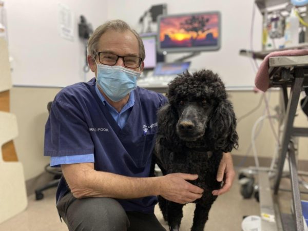
I’m famous around Carlton. When I’m gallivanting around, passers-by will comment on the pep in my step, and on the perfect alignment of my posture. I relish these walks, so when Stuart or Barbara present my lead I leap up to attention and even nudge them along. When I’m reluctant, something is wrong.
Over the last few weeks, I didn’t have a pep in my step. In fact, I just slept for the vast majority (as opposed to the majority) of the time. I felt weak and sluggish, something was NQR. This was not the dog you know and love.
So rather than shrugging it off as the weather of the effects of lockdown, off I went to Lort Smith and unfortunately, surgery was needed. I spent a couple nights in hospital and although there was a decent surplus of pats, kind talking and expert care… I missed Stuart and Barbara and I knew that they and the rest of Pesel & Carr would have been falling apart in my absence. I could almost hear the staff wailing from the office back in Carlton.
Luckily, with my surgery complete and healing well, I was free to go. Though I’m still a bit shaky, I am recovering, and being back in the office is helping.
A big thanks to Dr Harold who took care of all my scans, Dr Denae for the expert surgery and to all the dedicated nurses and team at Lort Smith, whose hard work have ensured that I am back on my way to grabbing life by the bone!
