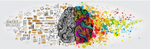
In a great sea of information, what customers choose to consume is based on immediacy. How quickly can they understand you, your brand, and its purpose? Is it worth their time to learn more? The saying ‘A picture is worth a thousand words’ is perhaps truer now, in this digital age, than it has ever been. So when it comes to communicating with customers, good design can be everything.
It takes a 10th of a second to form an impression of a person. That means that our first impressions are not defined by what is said, but by a combination of appearance, mannerisms and behaviour. Without these observations, our ability to determine if a person is approachable or not is hindered.
It takes
50 milliseconds for a person to form a first impression of a website, and to decide whether they will stay or leave. British researchers focusing on health websites found that 94% of first impressions were based on design. The actual content on the website only accounted for 6% of first impressions. They also found that if a customer didn’t like an aspect of a website’s design, they rarely explored beyond the homepage. The takeaway from all of this? Design matters.
Design encompasses the use of symbols and icons, along with form, function, colour and place. And let’s not forget elements of behavioural science, too. Design is reductive, distilling the essential to communicate a point. When done well, it can be the ultimate form of empathy, making a customer think ‘
You know me, and you know what I want’.
The assets of the newly launched
Hay Bank are a perfect example of how design can speak. Hay’s identity is very different to your typical bank. Their homepage is colourful and friendly – minimal text and movement draws your attention to all the right places. You discover what you need to immediately. Their look is the opposite of corporate, immediately catching the attention of a younger generation that values transparency and integrity. They have achieved a sense of familiarity that might have existed at a local bank, before the internet. You know where to go and, most importantly, you know it’s Hay.
Architectural Digest, which is celebrating its 100th birthday this year, recently re-launched
Clever, a digital offshoot of the venerable publication aimed at 18-34 year olds. The original
Architectural Digest brand remains, in both print and online, and keeps its clean, cool design aimed at industry insiders.
Clever is a simple website that targets a generation of home enthusiasts perfectly, using bright pops of striking colours to house the information in a way that makes it more accessible and fun. They also release regular digital magazine covers specifically designed to share on social media.
Clever leverages a century of experience and reputation from
Architectural Digest, but its design breaks barriers, opening the content up to everyday people. . As Executive Digital Director
Keith Pollock says: “The
Clever reader appreciates a well-designed home, but they have questions about how to attain it.” They don’t have this written all over the website. They achieve their message simply: through design.
Through everything from your website to your e-newsletter, your output is telling audiences about your brand. Passing up the opportunity to use good design can deter the very people you are hoping to engage. The cost of getting it right is minimal in comparison. Aside from that, well-designed assets and a cohesive ‘voice’ make you and your audience’s experience easier. And if you
are going for a younger market, this is important. No one appreciates ease like a millennial.
Design is constant problem solving. It’s conversation; it’s understanding; it’s enabling both diversity and inclusiveness. Influential contemporary graphic designer
Paula Scher said: “The job of the designer is to make things understandable, usable, accessible, enjoyable, and important to a public, that involves the public.”
It is said that you shouldn’t judge a book by its cover. Maybe that’s true. But a cover can tell you a lot about what’s inside, and can entice you to read on.