Have you ever considered how colour influences you? How it makes you feel? How it draws you in or pushes you away?
Colour is highly personal and your own preference has everything to do with personality and mood. Now, imagine your audience and all their individual preferences… With an audience of hundreds, thousands or even millions, how can you colour your communications for targeted engagement? Luckily, there are people who study colour and even though unique perceptions are abundant, Colour Psychology posits that there are trends to follow.
Colour Psychology has become a popular feature of colour theory (a practical combination of art and science that’s used to determine what colours look good together). It analyses the psychological effects of colour and its influence on behaviour. This knowledge often informs how marketers target consumers. McDonald’s have been extremely successful in making colour speak ‘McDonalds’ – using red to make you hungry and yellow to make you happy, paired with their delicious (albeit questionable) range of food. They have mastered their market and solidified red and yellow as theirs.
Green is perhaps one of the most intriguing colours. It surrounds us in nature; it’s naturally positive and exudes growth and freshness. Green was used famously by Sydney based brand agency Hulsbosch for Woolworths, ‘The Fresh Food People’. The work won international awards and is considered one of the most successful rebrands in Australian history.
The decision to use green to represent fresh food and produce may seem obvious, however, the tone and hue are vital to its success. Feeling green with envy?
Maybe you are feeling ‘blue’? Blue is not just sad. In fact it’s a colour preferred by corporate organisations to instil a sense of trustworthiness, stability and reliability – like the sky, it’s always there. Tech companies like IBM, social media platforms like Facebook and LinkedIn and, financial organisations such as Visa and PayPal have all adopted a tone of blue. We wonder if Blu-tack had the same idea? It sticks!
If emotional and physical associations aren’t complicated enough, add culture, age and gender to the equation. In Western society, for example, it is generally considered that blue is the colour for newborn boys and pink for newborn girls. However, in China black is the colour associated with boys while blue represents girls.
It’s important to know that colour takes on a different meaning in different cultural contexts. In 2017, Apple launched a special-edition iPhone 7 in more than 40 countries, its gleaming red aluminium back contrasting to the minimal shades of white and black generally associated with the product. The bold colour represented AIDS awareness and proceeds from sales went to a charity, which aims to wipe out the virus. In China, however, where AIDS was once considered a consequence of contact with the west, Apple opted to decouple the device’s association. In the western context, red is the colour of emergency, so appropriately represents global health threats. In China, it is the national colour, representing happiness, success and good fortune. By removing the association of the iPhone with the virus, Apple quietly left Chinese consumers to their own associations. Perhaps the tone was a perfect match to China’s red?
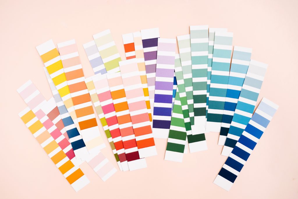
When exploring the nuances of colour psychology the importance of tone cannot be taken for granted. As kids we learn the primary colours, then the secondary colours, and as we grow we develop an appreciation for tone. Mauve, sage, crimson, take precedence over purple, green and red. Who can forget Patrick Bateman sweating over the superiority of his colleague’s “off white” business card to his “bone” coloured one?
Without detailed knowledge of why certain colours, tones and hues work together and why some don’t, we are convinced by unconscious feelings.
Assuming the bulk of your audience are relying on their feelings, choosing the right tone and hue (not just colour) is crucial. Bottom line – Getting the colour ‘just right’ can be fundamental to the development of any successful brand and can increase brand recognition by as much as 80%.
Colour is a powerful tool. Connecting to your audience emotionally, through the use of colour, will enhance your communications. Knowing the personality and psychological effects of different colours – including tones and hues – is next level sophistication.
Are you considering using colour strategically for your next campaign?
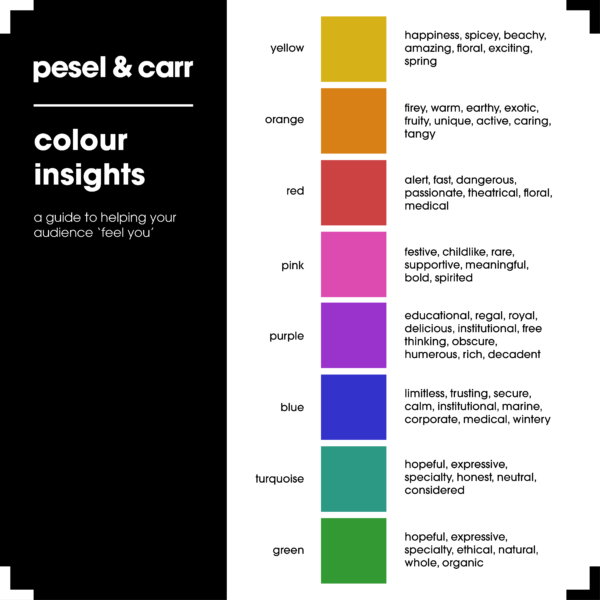
Have a look at the following list a table of contents of sorts. This will be your point of reference from which to navigate the depths of colour psychology.
Alternatively, talk to us for a strategic consultation about how your brand can best utilise colour in campaigns.


Do you see what I smell?
Humans! Always on about visuals.
I feel compelled to inform readers that dogs see the world a little differently. Seeing red? The title asks. The answer for dogs is a resounding no!
People are normally able to identify three colour combinations (red, blue and green) while dogs are limited to two (yellow and blue). So our perception of colour is limited. We are good at distinguishing between variations of blues and yellows but have difficulty processing red and green, which likely appear to us more as browns and greys.
But don’t feel bad. While our sense of sight may not be up to scratch, our sense of smell leaves humans for dust! Your noses contain about six million receptors, while ours possesses up to an astonishing 300 million. To put it in terms of sight, what you see 500 metres away, a dog can see nearly 5000 kilometres away, just as clearly. We’re also adept at discriminating between odours. While you may detect the smell of a teaspoon of sugar in your coffee, a dog can detect it in a million litres of water.
So, while I may have a little trouble telling the special red iPhone apart from a normal black one; when you need something urgently sniffed, from diseases to bombs to drugs to cancer you know who to call!


